XF offers three types of 2-D graphs for viewing results:
- XY Graph: displays data in a Cartesian coordinate system.
- Polar Graph: displays data in a polar coordinate system with a radius as a function of angle.
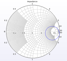
- Smith Chart: displays complex data vs. frequency, such as S-parameters and reflection coefficient.
Once a graph has been opened, XFdtd offers various tools for modifying the plotted results. The type of graph being viewed determines which tools are available.
Viewing Data
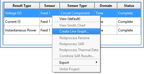
Graphs are most commonly used to view simulation results. In the results browser, double-clicking on a result generates that data's default graph, and right-clicking, then choosing Create Line Graph accesses non-default views.
Following are examples of results that can be plotted:
- All broadband port sensor data including voltage, impedance, S-parameters, and input power.
- Discrete frequency data from a system sensor including system efficiency and radiated power.
- Time-domain and frequency-domain data for a point sensor.
- Data for either a surface or volume sensor when specific locations within that sensor are specified.
- Broadband far zone sensors at specific angles or 2-D slices of steady-state far zone data.
In addition to simulation results, various types of data can be accessed and graphed through XF's scripting API:
- Post-processed data can be added to a graph.
- Material properties.
- Waveform properties.
Exporting Tools
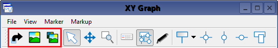
XF's three exporting capabilities are available for each of the graph types:
- Export Data: exports graphical data point values to a text file in a specified directory.
- Export Image: saves a screen capture to a file in a specified directory.
- Copy Image to Clipboard: copies a screen capture to the user's system clipboard for pasting into other applications.
- Ctrl+Alt+F10: copies a screen capture of the active XF window—either the graph or the geometry view—to the user's system clipboard for pasting into other applications.
View-Manipulation Tools
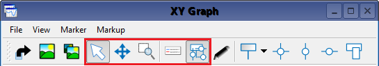
The  Select tool selects, moves, deletes, and edits a graph marker's properties and is available for each of the graph types.
The tool performs the following actions while it is active:
- Left-clicking on an existing marker changes its color to yellow, indicating that it has been selected.
- Left-clicking on a plot changes it to bold both in the graph and in the legend, indicating that it has been selected.
- Ctrl +: selects either multiple markers or plots.
- Left-clicking and dragging moves a selected marker to another graphical location.
- Right-clicking on one or more selected markers displays options, including Properties and Delete.
- Right-clicking on one or more selected plots displays options, including Properties, Copy, and Delete.
- Selecting an attached marker and using the mouse wheel moves it along its plot.
- Ctrl+ scrolling: speeds up the selected marker's movement while using the mouse wheel.
The select tool also serves as an alternative method for changing the bounds of the graph:
- Right-clicking and dragging performs the same panning motions as the pan tool.
- Using the mouse wheel performs the same zooming action as the zoom tool.
The  Pan Tool moves the viewed region within a graph, and is available in both XY and polar graphs.
- Left-clicking and dragging within the graph applies the tool's default behavior, allowing the view to move in any direction.
- Ctrl+ dragging: restricts motion to the horizontal axis.
- Shift+ dragging: restricts motion to the vertical axis.
The  Zoom Tool moves the graph view either closer or farther for increased detail or a broader perspective, respectively. It is available in both the XY and polar graphs.
- Left-clicking and dragging within the graph outlines a rectangular region of the graph to zoom in on.
- Ctrl+ dragging: restricts motion to horizontal axis.
- Shift+ dragging: restricts motion to vertical axis
The  Legend Visible button toggles the legend display within the graph and is available for each graph type. While displayed, the legend can be moved using any active view manipulation tool by left-clicking on the legend and dragging it within the graphical space.
The  Markers Visible button toggles each marker tool's display within the graph and is available for each graph type.
Graph Properties
Each of the graph types includes a  Graph Properties tool that toggles the graph and plot settings that contain three tabs with editing options.
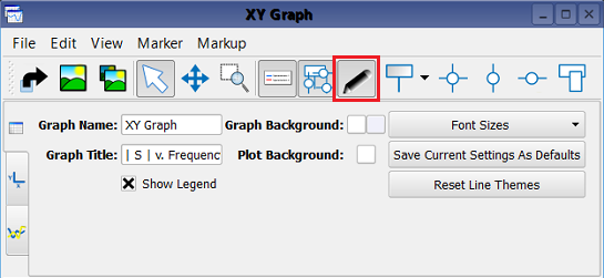
The  Graph Properties tab provides general settings, such as the title, font, and background color. Various font size selections can be saved as the default settings for subsequent graphs by clicking the Save Current Settings As Defaults button. Reset Plot Themes reverts the colors and line styles of visible plots to the default themes. Users can also access this tab by right-clicking within the graph.
The  Axes Properties tab includes axes editing options, such as the title, bounds, tick spacing, and units used for each axis. Selecting the Auto checkbox allows XF to determine the bounds. When plotting frequency-domain data, such as S-parameters, the bounds of the graph are set to the frequency range of interest as defined when creating the simulation that produced the data. The Units drop-down arrow displays options for specifying the graph's units.
In the X-Axis properties of an XY graph, these options include a Log checkbox that allow XF to determine the maximum value, $maxValue$, from all plots in the graph and apply the normalization,
\begin{equation} p^{\prime}(x) = log(p(x)/maxValue) \end{equation}where $p^{\prime}(x)$ is the normalized plot of $p(x)$. This feature is commonly applied when determining the -3dB level for far-zone radiation patterns.
Certain Smith charts provide the option of adjusting the Reference Impedance value.
The  Plot Properties tab allows users to inspect and edit the properties of all the plots in the graph. Selecting a plot in the list enables the (
 ,
,  ,
,  ,
,  ,
,  ) buttons to show and hide the plot, reorder the plots—both in the list and in the legend—copy the plot to paste into a different graph, and delete the plot, respectively. Two tabs appear on the right side of the plot properties tab that provide options for rendering a plot. The Lines tab controls the use of line segments for connecting sampled data points and how those segments are rendered. The Data Points tab controls the representation of each individual data point, as well as how the data points are rendered. Users can also access the Plot Properties tab, as well as the copy capability, by right-clicking on the plot within a graph.
Marker Tools
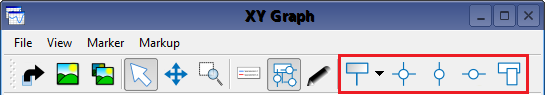
Markers allow users to read data values at specific points on a graph, and are placed using the appropriate tool. When the mouse moves close to the plotted curve, it is snapped to the closest location on the interpolated line or sampled point. Markers placed on sampled points appear blue, and markers placed on interpolated points are black.
Keyboard shortcuts are applicable to each of the marker tools, and offer additional control over marker placement:
- Ctrl+: disables snapping action, allowing a point to be placed anywhere.
- Shift+: snaps the marker to sampled points only.
The  Point Marker Tool creates a marker at a specific point on a plot by clicking on the desired location while the tool is active. Each marker appears with numerical information that is dependent upon the graph type.
- XY graph: (X location, Y location)
- Polar graph: (radius, angle)
- Smith chart: (real part of location, imaginary part of location, frequency)
The  Crosshairs Tool marks the location of a single point with two intersecting crosshairs, and the marker is placed at the right edge of the plot when the Markers Visible button is active. This tool is available for each of the graph types.
The  Vertical Marker Tool places a vertical line that intersects with the x-axis, and the marker is placed along the upper edge of the plot area when the Markers Visible button is active. This tool is available for XY graphs only.
The  Horizontal Marker Tool places a horizontal line that intersects with the y-axis, and the marker is placed along the right side of the plot area when the Markers Visible button is active. This tool is available for XY graphs only.
The  Create region highlight tool highlights a region vertically, horizontally, or bound in both directions for easier viewing and does not have a marker. This tool is available for XY graphs only. Users should note that the name of a highlighted region will not appear within the graph, but it can be used to specify the region through scripting.
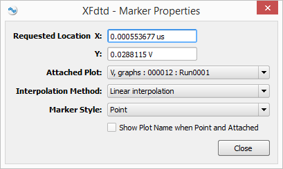
An existing marker can be edited while the select tool is active by right-clicking on a marker and choosing Marker properties. This option displays settings that are dependent upon the graph type, including the requested location, Attached Plot, Interpolation Method, and Marker Style.
In the Marker properties editor, the marker's location coordinates are adjusted by typing the desired values into the requested location section of the dialog window. The Attached Plot option attaches the marker to a particular plot when the desired plot name is chosen from the drop-down menu, enabling the Interpolation Method setting for selection. This definition determines whether the marker will be shifted to the nearest point on the selected function, or linearly interpolated based on the independent axis entered in the requested location dialog window. The marker type is redefined by selecting from the Marker Style drop-down menu, and the plot name of an attached marker is displayed by checking the Show Plot Name when Point option.